Colors are an essential part of our lives, infusing the world with beauty and vibrancy. They help us express our feelings and navigate the world around us. Understanding Colors Vocabulary and Common Color Names can be the key to unlocking this colorful language. In this blog post, we’ll take a journey into the fascinating realm of color words, focusing on the most Common Color Names we use every day. Whether you’re an artist seeking to improve your work or someone who just wants to talk about colors with confidence, this exploration will equip you with the words you need to describe the rainbow of hues in the world around you.
Colors go far beyond what meets the eye; they evoke emotions and convey meanings. We all know the basics like red, blue, yellow, and green, but what about the subtle distinctions between shades like turquoise and teal? Can you differentiate between magenta and fuchsia? This blog post will not only introduce you to the most Common Color Names, but also help you grasp the unique characteristics of each. This way, you can become a more eloquent and creative communicator, whether you’re selecting the perfect paint for your bedroom, describing the shade of your favorite dress, or bringing life to your art.
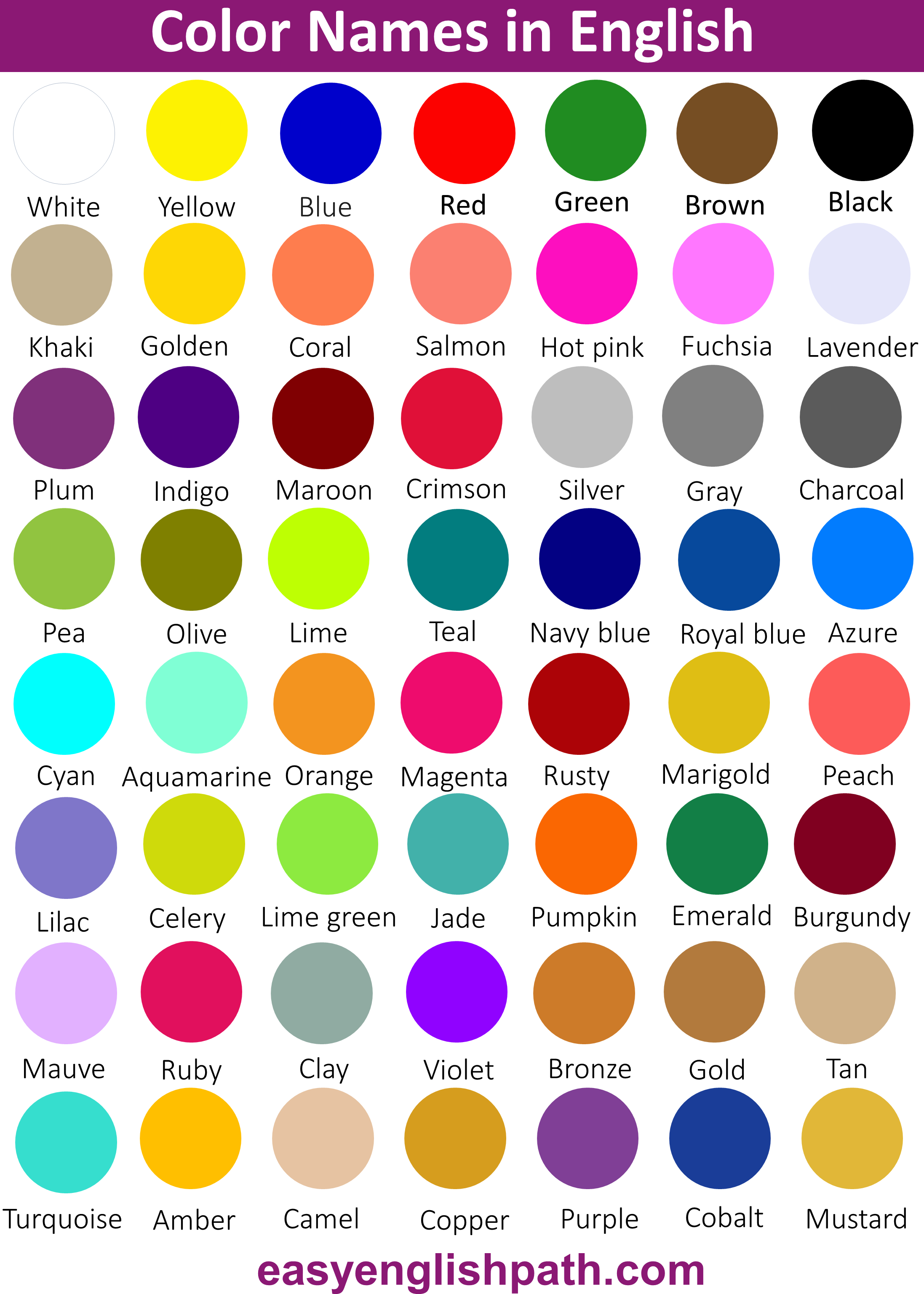
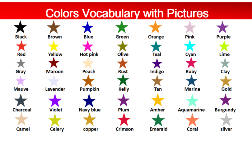
Colors Names with pictures
Common Colors Names
| Sr. No | Color Name | Color Image |
| 1 | Red |  |
| 2 | Orange |  |
| 3 | Yellow |  |
| 4 | Green |  |
| 5 | Blue |  |
| 6 | Purple |  |
| 7 | Pink |  |
| 8 | Brown |  |
| 9 | Black |  |
| 10 | White |  |
| 11 | Gray |  |
| 12 | Lavender |  |
| 13 | Maroon |  |
| 14 | Olive |  |
| 15 | Crimson |  |
| 16 | Indigo |  |
| 17 | Khaki |  |
| 18 | Magenta |  |
| 19 | Navy blue |  |
| 20 | Peach |  |
| 21 | Teal |  |
| 22 | Turquoise |  |
| 23 | Violet |  |
| 24 | Gold |  |
| 25 | Silver |  |
| 26 | Bronze |  |
| 27 | Copper |  |
| 28 | Tan |  |
| 29 | Cyan |  |
| 30 | Mustard |  |
| 31 | Coral |  |
| 32 | Burgundy | 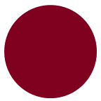 |
| 33 | Lilac |  |
| 34 | Rust | 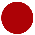 |
| 35 | Royal blue |  |
| 36 | Salmon |  |
| 37 | Amber |  |
| 38 | Aquamarine |  |
| 39 | Azure |  |
| 40 | Camel |  |
| 41 | Celery |  |
| 42 | Charcoal |  |
| 43 | Clay |  |
| 44 | Cobalt |  |
| 45 | Emerald |  |
| 46 | Fuchsia |  |
| 47 | Golden |  |
| 48 | Hot pink | 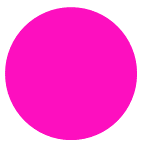 |
| 49 | Lime green | 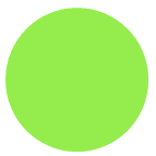 |
| 50 | Pumpkin | 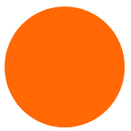 |
Colors Vocabulary with Some Detail
Emerald:
Emerald green is a deep and beautiful shade of green, like the color of emeralds. It’s often linked with luxury and nature and is used in fashion, design, and jewelry to create a sense of beauty and style.
Charcoal:
Charcoal is a very dark gray or almost black color. It’s named after the stuff used for drawing and grilling. Artists use it for dark and smudgy drawings.
Celery:
Celery color is a pale, soft green, like the color of celery itself. It’s a calm and natural color often used in fashion and interior design to create a soothing and fresh feeling.
Azure:
Azure is a bright and beautiful shade of blue, like the color of a clear sky. It’s a calming and peaceful color often used in art, flags, and room decoration to create a relaxing and fresh atmosphere.
Hot pink:
Hot pink is a very bright and lively shade of pink. It’s full of energy and fun, often seen in fashion and design to create an eye-catching and dynamic look. This color is all about being bold and getting noticed.
Camel:
Camel color is like a warm, earthy brown, similar to the fur of a camel. People like it because it goes with a lot of other colors and can make clothes and rooms feel cozy and inviting.
Salmon:
Salmon color is a soft, pinkish-orange, like the color of salmon fish. It’s used a lot in clothing and home decor , especially in the spring and summer. It gives a feeling of freshness and warmth.
Rust:
Rust color is a warm, reddish-brown, like the color of rust you find on old metal. People like it for clothes and decorating homes because it gives a cozy and rustic feeling.
Coral:
Coral color is a warm, cheerful mix of pink and orange, like the pretty colors you see in the ocean on coral reefs. People use it for clothes, decorations, and more, especially in spring and summer.
Pumpkin:
Pumpkin color is a warm, rich orange, just like the color of ripe pumpkins in the fall. It reminds us of autumn and is often used for decorations during Halloween and Thanksgiving. People use it in clothing and home decor to create a cozy and inviting feeling.
Lilac:
Lilac is a soft and gentle shade of purple with a hint of pink. It’s named after the lovely lilac flowers you see in the spring. People like it because it feels calm and soothing.
Silver:
Silver is a shiny, metallic color that looks like the precious metal silver. It’s a cool, bright shade of gray that’s often linked with luxury and elegance. People use it in things like jewelry, fancy dishes, and high-end designs.
Lavender:
Lavender is a soft and calming shade of purple, like the color of lavender flowers. It’s often used in fashion during the spring and summer because it feels fresh and delicate. In interior design, lavender is used to create a peaceful and gentle atmosphere.
Teal:
Teal is a color that’s a mix of blue and green, a bit like the color of the ocean. It’s vibrant and calming at the same time. People like it for fashion, accessories, and interior design because it adds a touch of sophistication and a pop of color.
Navy blue:
Navy blue is a very dark and rich shade of blue, almost like black. It’s called “navy” because it’s the color of the uniforms worn by officers in the British Royal Navy. It goes well with many other colors, and it’s often linked to nautical and maritime themes. It’s also seen as a formal and professional color.
Burgundy:
Burgundy is a deep, rich shade of red that looks a bit like a mix of red and brown or red and purple. It’s named after the famous Burgundy wine from France. People like it because it feels elegant and luxurious.
Olive:
Olive is a calm and muted shade of green, like the color of ripe olives. It’s used in fashion for casual and military-style clothing because it gives a sense of simplicity and practicality. In interior design, olive is great for creating a calm and nature-inspired atmosphere, often paired with colors like beige and brown.
Maroon:
Maroon is a deep, dark red color with hints of brown or purple. It’s often linked to elegance and seriousness. People choose maroon for formal events and interior design because it looks rich and mature.
Brown:
Brown is a warm, earthy color that’s like the color of soil and wood. It comes in different shades, from light tan to deep chocolate. People use brown in interior design to create a cozy and natural atmosphere, often seen in wooden furniture and decor.
Red:
Red is a vibrant and intense color, like fire or blood. It’s known for its strong emotional impact, often connected to feelings of love, anger, and excitement. In different cultures, red can symbolize luck or caution.